Using Bootstrap With Your base.html
Using Bootstrap
One recommendation is to use Bootstrap as the base for you website (while using template inheretence). It will allow you to improve the look and feel of your website. Your base.html that takes advantage of bootstrap should look like this:
<!doctype html>
<html lang="en">
  <head>
    <meta charset="utf-8">
    <meta name="viewport" content="width=device-width, initial-scale=1">
    <title>{% block title%}{% endblock %}</title>
    <link href="https://cdn.jsdelivr.net/npm/bootstrap@5.3.2/dist/css/bootstrap.min.css" rel="stylesheet" integrity="sha384-T3c6CoIi6uLrA9TneNEoa7RxnatzjcDSCmG1MXxSR1GAsXEV/Dwwykc2MPK8M2HN" crossorigin="anonymous">
  </head>
  <body>
    {% block content %}
    {% endblock %}
    <script src="https://cdn.jsdelivr.net/npm/bootstrap@5.3.2/dist/js/bootstrap.bundle.min.js" integrity="sha384-C6RzsynM9kWDrMNeT87bh95OGNyZPhcTNXj1NW7RuBCsyN/o0jlpcV8Qyq46cDfL" crossorigin="anonymous"></script>
  </body>
</html>
The template is basically the starter template for bootstrap where we created two blocks:
- The title block, which you can extend to replace the text in the title bar.
- The content block, which you can extend to include content.
Keep in mind, that you can have as many block as you want in base and can name them as you like.
Using Bootstrap
You currently know how to use HTML tags correctly, bootstrap is all about setting the correct class for the HTML tag to get the look and feel that you desire.
For example, the following is a typical unordered HTML list:
<ul>
    <li>Item 1</li>
    <li>Item 2</li>
    <li>Item 3</li>
</ul>
Would look something like this:
- Item 1
- Item 2
- Item 3
Let’s change the look and feel to a numbered list using bootstrap. Based on the bootstrap documentation, we need to change the html code to the following:
<ul class="list-group list-group-numbered">
    <li class="list-group-item">Item 1</li>
    <li class="list-group-item">Item 2</li>
    <li class="list-group-item">Item 3</li>
</ul>
All we did was set the required class for each tag, and this is what we get:
- Item 1
- Item 2
- Item 3
If you further examine the content, you can even add subheadings where sometime you might need to add div tags. All we did is place a div tag inside list item, and another div tag to set the item text to bold:
<ul class="list-group list-group-numbered">
    <li class="list-group-item">
        <div class="ms-2 me-auto">
            <div class="fw-bold">Item 1</div>
            Content for item 1
        </div>
    </li>
    <li class="list-group-item">
        <div class="ms-2 me-auto">
            <div class="fw-bold">Item 2</div>
            Content for item 3
        </div>
    </li>
    <li class="list-group-item">
        <div class="ms-2 me-auto">
            <div class="fw-bold">Item 3</div>
            Content for item 3
        </div>
    </li>
</ul>
This is how it would look:
- Item 1Content for item 1
- Item 2Content for item 3
- Item 3Content for item 3
We can also add a numeric round icon to the list using a span tag:
<ul class="list-group list-group-numbered">
    <li class="list-group-item">
        <div class="ms-2 me-auto">
            <div class="fw-bold">Item 1</div>
            Content for item 1
        </div>
        <span class="badge bg-primary rounded-pill">10</span>
    </li>
    <li class="list-group-item">
        <div class="ms-2 me-auto">
            <div class="fw-bold">Item 2</div>
            Content for item 3
        </div>
        <span class="badge bg-primary rounded-pill">20</span>

    </li>
    <li class="list-group-item">
        <div class="ms-2 me-auto">
            <div class="fw-bold">Item 3</div>
            Content for item 3
        </div>
        <span class="badge bg-primary rounded-pill">30</span>

    </li>
</ul>
Which would look something like this:
- 10Item 1Content for item 1
- 20Item 2Content for item 3
- 30Item 3Content for item 3
We can fix then how the items are layed out using flex component layout by adding to the classes for the list item:
<ul class="list-group list-group-numbered">
    <li class="list-group-item d-flex justify-content-between align-items-start">
        <div class="ms-2 me-auto">
            <div class="fw-bold">Item 1</div>
            Content for item 1
        </div>
        <span class="badge bg-primary rounded-pill">10</span>
    </li>
    <li class="list-group-item d-flex justify-content-between align-items-start">
        <div class="ms-2 me-auto">
            <div class="fw-bold">Item 2</div>
            Content for item 3
        </div>
        <span class="badge bg-primary rounded-pill">20</span>
    </li>
    <li class="list-group-item d-flex justify-content-between align-items-start">
        <div class="ms-2 me-auto">
            <div class="fw-bold">Item 3</div>
            Content for item 3
        </div>
        <span class="badge bg-primary rounded-pill">30</span>
    </li>
</ul>
It would now look something like this:
- 10Item 1Content for item 1
- 20Item 2Content for item 3
- 30Item 3Content for item 3
As you can see, bootstrap gives you control over the look and feel, in addition, it allows you to control how the components are layed out and organized.
Bootstrap Themes
My recommendation is to combine using bootstrap with bootstrap themes. You can get a list of the standard bootstrap themes (bootswatch) from the bootsrap CDN.
To use them, select the theme that you like then click on the arrow next to “try it’ button and choose the HTML tag to use the theme and copy it:
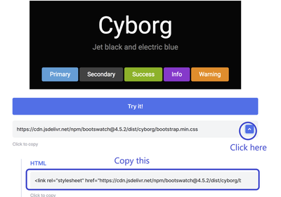
You can then paste the html link tag in your base.html directly below the bootstrap CSS link tag:
<!doctype html>
<html lang="en">
  <head>
    <!-- Required meta tags -->
    <meta charset="utf-8">
    <meta name="viewport" content="width=device-width, initial-scale=1">

    <!-- Bootstrap CSS -->
    <link href="https://cdn.jsdelivr.net/npm/bootstrap@5.1.3/dist/css/bootstrap.min.css" rel="stylesheet" integrity="sha384-1BmE4kWBq78iYhFldvKuhfTAU6auU8tT94WrHftjDbrCEXSU1oBoqyl2QvZ6jIW3" crossorigin="anonymous">

    <!-- Cyborg theme -->
    <link rel="stylesheet" href="https://cdn.jsdelivr.net/npm/bootswatch@4.5.2/dist/cyborg/bootstrap.min.css" integrity="sha384-nEnU7Ae+3lD52AK+RGNzgieBWMnEfgTbRHIwEvp1XXPdqdO6uLTd/NwXbzboqjc2" crossorigin="anonymous">

    <title>{% block title%}{% endblock %}</title>
  </head>
  <body>
    <script src="https://cdn.jsdelivr.net/npm/bootstrap@5.1.3/dist/js/bootstrap.bundle.min.js" integrity="sha384-ka7Sk0Gln4gmtz2MlQnikT1wXgYsOg+OMhuP+IlRH9sENBO0LRn5q+8nbTov4+1p" crossorigin="anonymous"></script>

    {% block content %}
    {% endblock %}
  </body>
</html>
Now the general color look and theme will follow the cyborg theme.
Adding a navigation barWhen
When you click on the theme you like, you will be shown many components and how they look in the theme. When you bring your mouse cursor over any compnent, you will see a <> icon showup. Click on it to see the source code on how to create such a component.
So select one of the navigation bars and show its source code. Then copy the code and paste it in your base.html but above the content tag and inside the body tag. This will ensure that it will show up in your your views. Your base will look like this:
<!doctype html>
<html lang="en">
  <head>
    <!-- Required meta tags -->
    <meta charset="utf-8">
    <meta name="viewport" content="width=device-width, initial-scale=1">

    <!-- Bootstrap CSS -->
    <link href="https://cdn.jsdelivr.net/npm/bootstrap@5.1.3/dist/css/bootstrap.min.css" rel="stylesheet" integrity="sha384-1BmE4kWBq78iYhFldvKuhfTAU6auU8tT94WrHftjDbrCEXSU1oBoqyl2QvZ6jIW3" crossorigin="anonymous">

    <!-- Cyborg theme -->
    <link rel="stylesheet" href="https://cdn.jsdelivr.net/npm/bootswatch@4.5.2/dist/cyborg/bootstrap.min.css" integrity="sha384-nEnU7Ae+3lD52AK+RGNzgieBWMnEfgTbRHIwEvp1XXPdqdO6uLTd/NwXbzboqjc2" crossorigin="anonymous">

    <title>{% block title%}{% endblock %}</title>
  </head>
  <body>
    <script src="https://cdn.jsdelivr.net/npm/bootstrap@5.1.3/dist/js/bootstrap.bundle.min.js" integrity="sha384-ka7Sk0Gln4gmtz2MlQnikT1wXgYsOg+OMhuP+IlRH9sENBO0LRn5q+8nbTov4+1p" crossorigin="anonymous"></script>

<nav class="navbar navbar-expand-lg navbar-dark bg-primary">
  <div class="container-fluid">
    <a class="navbar-brand" href="#">Navbar</a>
    <button class="navbar-toggler" type="button" data-bs-toggle="collapse" data-bs-target="#navbarColor01" aria-controls="navbarColor01" aria-expanded="false" aria-label="Toggle navigation">
      <span class="navbar-toggler-icon"></span>
    </button>

    <div class="collapse navbar-collapse" id="navbarColor01">
      <ul class="navbar-nav me-auto">
        <li class="nav-item">
          <a class="nav-link active" href="#">Home
            <span class="visually-hidden">(current)</span>
          </a>
        </li>
        <li class="nav-item">
          <a class="nav-link" href="#">Features</a>
        </li>
        <li class="nav-item">
          <a class="nav-link" href="#">Pricing</a>
        </li>
        <li class="nav-item">
          <a class="nav-link" href="#">About</a>
        </li>
        <li class="nav-item dropdown">
          <a class="nav-link dropdown-toggle" data-bs-toggle="dropdown" href="#" role="button" aria-haspopup="true" aria-expanded="false">Dropdown</a>
          <div class="dropdown-menu">
            <a class="dropdown-item" href="#">Action</a>
            <a class="dropdown-item" href="#">Another action</a>
            <a class="dropdown-item" href="#">Something else here</a>
            <div class="dropdown-divider"></div>
            <a class="dropdown-item" href="#">Separated link</a>
          </div>
        </li>
      </ul>
      <form class="d-flex">
        <input class="form-control me-sm-2" type="text" placeholder="Search">
        <button class="btn btn-secondary my-2 my-sm-0" type="submit">Search</button>
      </form>
    </div>
  </div>
</nav>

    {% block content %}
    {% endblock %}
  </body>
</html>
When you open a view next time, you will see the navigation bar that you added shown on screen. Remember, you can replace the links and use hwat you have learned so far in the course to link the different views to the navigation bar. It will allow your users to easily navigate the different views of your web application. The navigation bar is also responsive, meaning it will adapt to whether the user is using a computer or smart phone screen and will show the navigation in a way that fits the screen.